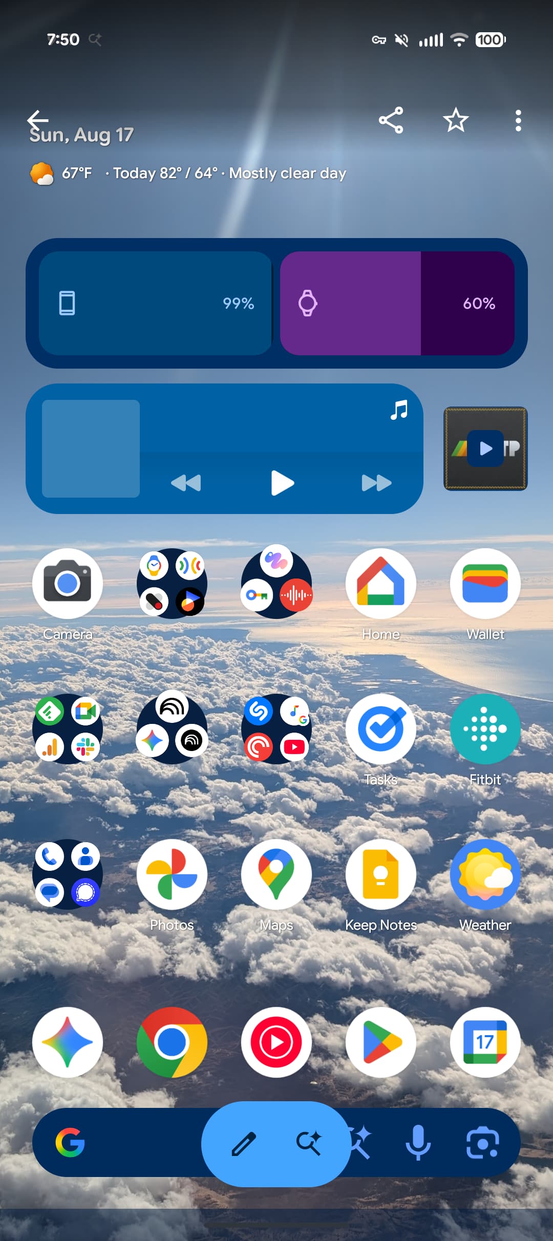
Google announced its new design language in May. Material 3 Expressive redesigns have been rolling out to Google apps since then, but the Pixel 10 and Android 16 QPR1 launch really kicked things off. Here’s our list of what’s available and still to come on Android phones.
Updated 11/17: Most Google apps now have M3 Expressive.
Table of contents
- Recent launches
- Fully launched
- Digital Wellbeing
- Files by Google
- Find Hub
- Gmail
- Google Calculator
- Google Calendar
- Google Chat
- Google Chrome
- Google Clock
- Google Contacts
- Google Docs, Sheets, and Slides
- Google Drive
- Google Home
- Google Keep
- Google Maps
- Google Meet
- Google Messages
- Google One
- Google Password Manager
- Google Photos
- Google TV
- Google Wallet
- My Pixel
- Phone by Google
- Pixel Buds
- Pixel Camera
- Pixel Recorder
- Pixel Screenshots
- Pixel Studio
- Pixel VIPs
- Pixel Watch
- Pixel Weather
- Quick Share
Recent launches
[New] Google Docs, Sheets, and Slides II
Following the editor in August, the homepages of Google Docs, Sheets, and Slides now have Material 3 Expressive. There’s the search app bar and large FAB, which is the only component themed with Dynamic Color today.


[New] Fitbit
The Fitbit app launching next year brings a complete Material 3 Expressive redesign. This includes the contained loading indicator, various M3 Expressive shapes, and the floating toolbar on metric pages.


Fully launched
(In alphabetical order)
Digital Wellbeing
Just the main page for this “app” (within Settings) has been updated with M3 Expressive. Besides containers, the donut graph is thicker. This is rolling out with beta version 1.30.x.


Files by Google
There’s an animated Material 3 carousel on the homepage with a pill-shaped toolbar for Quick Share and document scanning, while a navigation rail is now leveraged. When opening an image, there’s a toolbar for editing and Circle to Search. List views have larger previews at the left.


Find Hub
There’s a shorter bottom bar, while the sheet features more prominently rounded corners. One nice usability is how device pins are now larger.


Gmail
Your list of emails and the actual message are placed in a container, while there’s a prominent pill-shaped animation when using the swipe gestures. Meanwhile, a search app bar sees the hamburger button and profile menu move out of the pill-shaped field.


Google Calculator
Version 9.0 hides the row of scientific functions, while there’s now a history button (but the slide down gesture remains).


Google Calendar
Time slots (hours and days) are placed in their own rounded container throughout the app’s various views (Day, Week, Month). This replaces the faint lines used previously, while there’s now a solid background layer in the primary Dynamic Color. More
Additionally, a FAB menu is now leveraged for Event, Task, Out of office, and Birthday creation.
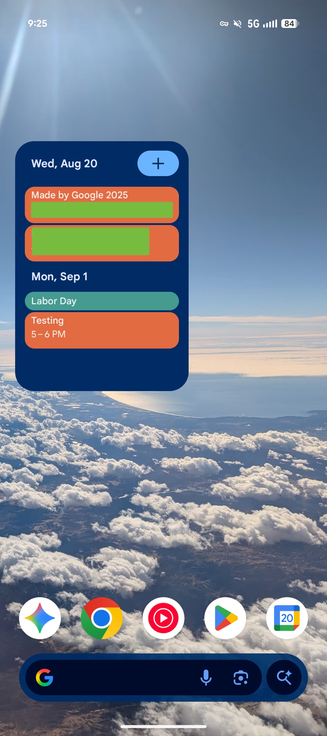
Widgets will get a pill-shaped button in the top-right corner, while most views drop the two-column layout.


Google Chat
Like Gmail, Google Chat makes use of a chat app bar and places the list of messages in a container. The floating toolbar leverages a pill to highlight what tab you’re currently viewing, while the chat interface places the ‘plus’ menu in a vertical pill.


Google Chrome
Circular containers are used for the top row of actions in the three-dot overflow menu. In the Tab Grid, the ‘new tab’ button and standard/Incognito/Groups switcher are placed in containers.


Google Clock
Version 8.1 is rolling out with a shorter bottom bar and a new font, while it’s now a rounded square FAB at the right.


Google Contacts
This straightforward redesign places everything in containers, while the bottom bar is now shorter. There are also color tweaks to the app’s background.


Google Docs, Sheets, and Slides
The updates in these three apps specifically apply to the editor interface with the new Material 3 Expressive progress indicator when waiting for documents to load. Pill-shaped buttons are used throughout, while the Format sheet is thoroughly modernized, including with the split button component.


Google Drive
This redesign gets a search app bar, short bottom bar, FAB menu, and button groups, while each line item is placed in a container.
The camera scanner is getting a redesigned editor that leverages Material 3 Expressive.


Google Home
The redesigned Google Home app features some Material 3 Expressive components like morphing buttons when you swipe between the Home feed’s top tabs and in the Automations creator. The “Ask Home” field is similar in function to a search app bar, while the glow that appears on app launch is certainly delightful. That said, it’s still a tall bottom bar.

Google Keep
Google Keep makes use of the new M3 Expressive search app bar component that moves the hamburger button and profile switcher outside of the search bar, which is now thicker. The other main update is on the notes page with all buttons (Archive, ‘plus’ menu, overflow, etc.) placed in containers.


Google Maps
Listings in Google Maps now make use of M3 Expressive containers to better group information. Additionally, the actions carousel more consistently appears at the bottom of your screen.


Google Meet
Google Meet is the first app to have widely rolled out a Material 3 Expressive redesign. On the homepage, each call is placed in a large/tall card as part of M3E’s heavy use of containers.
The pre-call screen sees more M3 Expressive with very large voice and video call buttons that seem out of proportion. The name, picture, and email address of who you’re calling is placed in a pill and centered at the top. Various buttons go from circles to rounded squares.


Google Messages
The list of conversations and message thread itself is now placed in containers. Google has also redesigned the ‘plus’ menu with all the buttons placed in pills. Other parts of the app getting Material 3 Expressive include New chat, Search, and Settings.


Google One
The app switches to a shorter bottom bar, while the cards (and Settings) are placed in more prominent containers. Meanwhile, Google One has removed its infographics for a denser app.


Google Password Manager
There’s a new search app bar with the Password Manager in the top-left corner. Filters for All, Passwords, Passkeys, and Network devices make a nice functionality update, while credentials are placed in containers.


Google Photos
A new backup indicator at the top of the app replaces “Google Photos.” On launch, you briefly get a logo that animates into “Backup complete.” You can drag down (pull-to-refresh) to see cycling Material 3 Expressive shapes on a background layer that also notes how much you have stored in the cloud. When something is backing up, there’s a wavy progress indicator.
Google TV
The Google TV app has a short bottom bar with a white accent color that is also used in three of the four tabs for the search pill. In the For you tab, that button is themed based on the media carousel.


Meanwhile, the remote gets updated button shapes. There’s also a morphing split button at the top for the device menu.


Google Wallet
In the top-left corner, “Wallet” has been replaced by the app logo, while there’s now a large FAB (floating action button) for Add to Wallet. Containers are leveraged throughout the app for Settings and Recent activity.


The NFC tap-to-pay animation also gets M3 Expressive. The background is now translucent with your card jumping up and down as part of a more animated success animation. Additionally, Google has a new overlay on newer Pixel phones with the double-tap power button gesture.


My Pixel
The Pixel Tips app is now called “My Pixel” and gets a complete overhaul that adds support options and a full Google Store.


Phone by Google
Compared to other apps, Phone by Google is using Material 3 Expressive as an opportunity for a complete overhaul. The bottom bar goes from four tabs to three with Favorites and Recents becoming “Home.” There’s a new “Keypad” tab that replaces the FAB, while “Voicemail” is unchanged. Contacts can now be found in a navigation drawer. All calls and lists (including Settings) make use of containers.
The Incoming and In-Call screens feature updated buttons with larger touch targets. You can pick between Horizontal swipe or Single tap.


Pixel Buds
The big update is to the Equalizer and how you customize Bud gestures.


Pixel Camera
The Camera redesign sees various button shape tweaks that help emphasize what’s currently selected. The Settings panel is shorter, while the main list benefits from Material 3 Expressive containers and a general reorganization.


Pixel Recorder
This Material 3 Expressive redesign aims to greatly simplify Recorder. For example, there’s an overflow sheet for the vast majority of actions on the recording page. The capture interface has also been simplified.


Pixel Screenshots
There’s now a rounded square FAB and other M3 Expressive tweaks.


Pixel Studio
Besides dropping the “preview” status, Pixel Studio 2.0 introduces a new image editor that replaces Markup in most instances. Featuring a Material 3 Expressive design, crop, draw/highlight, and caption are joined by generative AI tools. You can make stickers, erase, and change a selected part using prompts.


Pixel VIPs
Pill-shaped containers replace the circular buttons.

Pixel Watch
With the launch of the Pixel Watch 4, the companion app gets a new icon and more Material 3 Expressive. The initial redesign just applied to the homepage, with a second wave updating all menus with containers for improved visual separation.


Pixel Weather
Top comment by Timo Majoor
Is it just me or is all of this a bit underwhelming? Looking at the presentation at I/O I expected more, bigger, bolder shapes and colors. Some of these changes are so small I really have ro squint to see any change at all :/
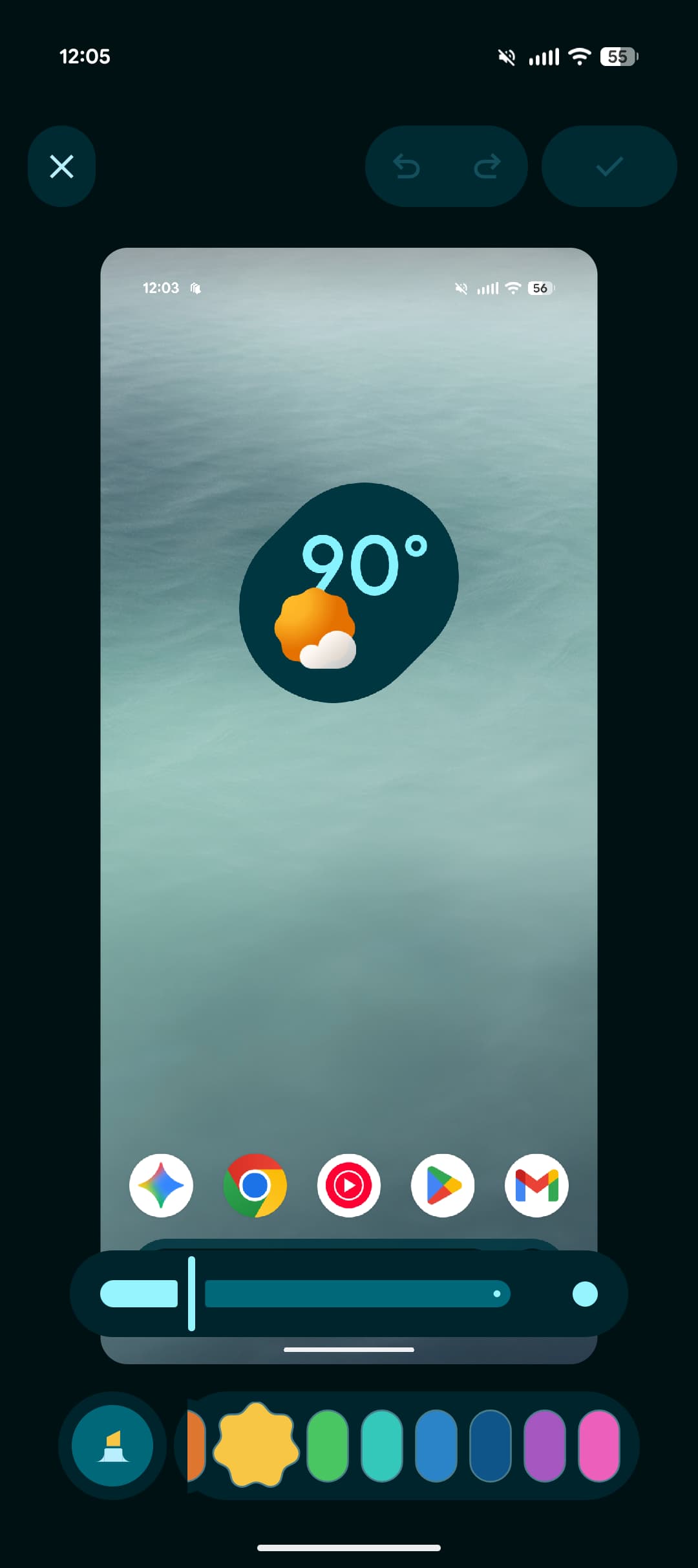
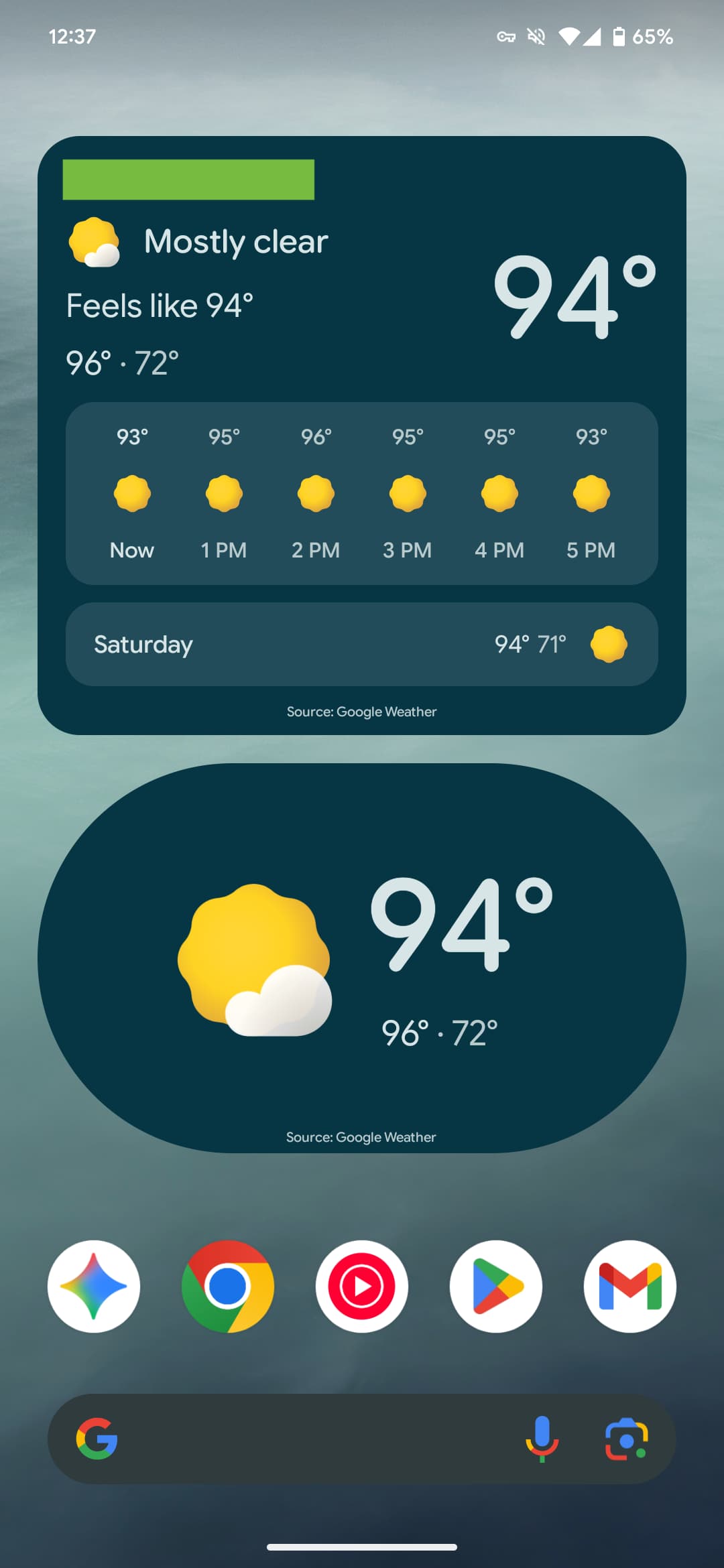
The Pixel Weather homepage expands the size of the city cards. You go from being able to see 10 locations to just six, but the high and low is now included. There are minor tweaks in the city view, with the big update being native homescreen widgets.


Quick Share
The new fullscreen Quick Share experience takes full advantage of Material 3 Expressive.


FTC: We use income earning auto affiliate links. More.


Comments