
Following the initial rollout, Google apps have been adding to or refining their Material 3 Expressive redesigns. Google Drive might now be toning down one aspect of M3 Expressive.
Previously, Google Drive placed the entire list view in a container with rounded corners. Additionally, each item is containerized with separation at the top and bottom.
We’re no longer seeing that main container, with each file or folder spanning the full-width of the screen like before. It is a rather subtle change. The bottom search app and bottom bars return to being separate containers instead of existing on the same connected (background) surface.
Old vs. new

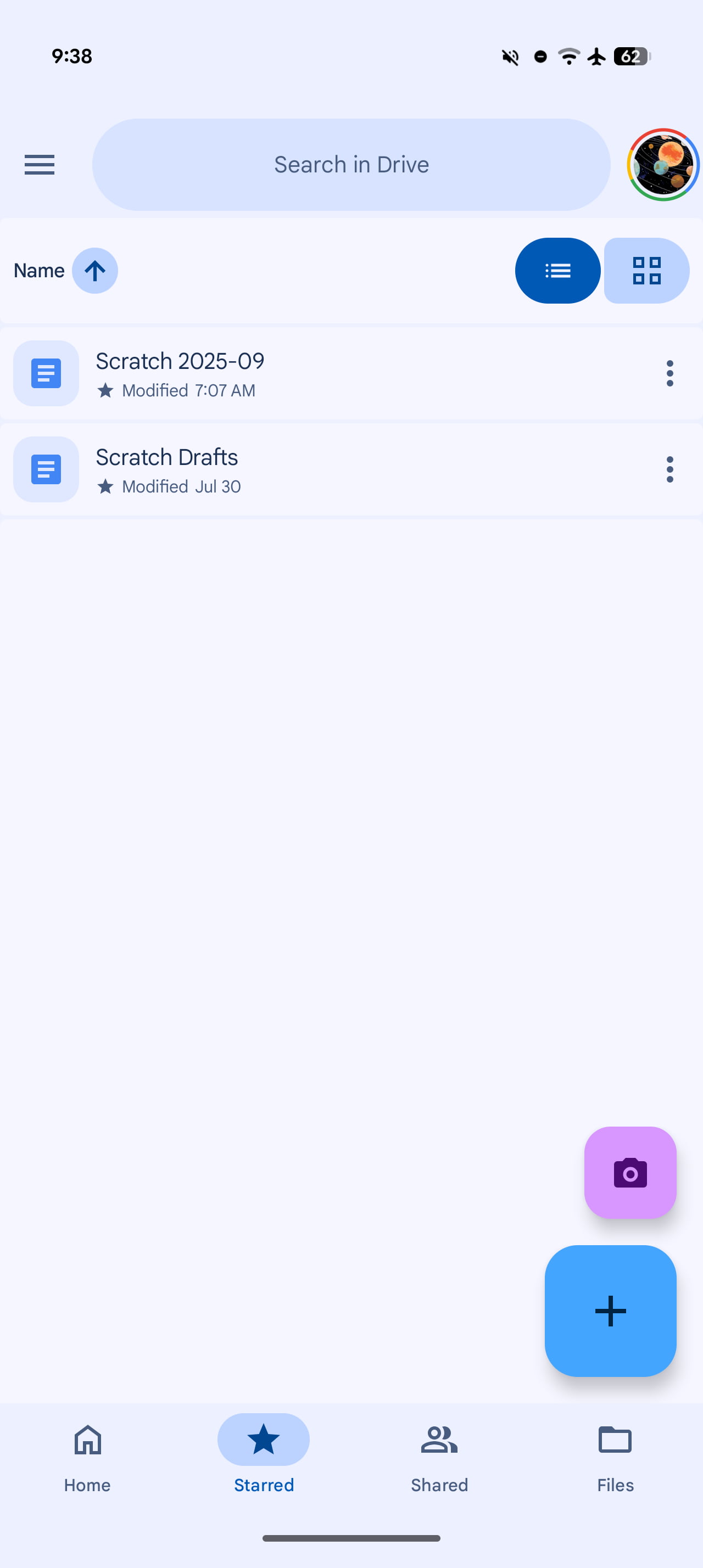
The main container (and connected button group for the list/grid switcher) were the last Material 3 Expressive components to roll out.
It’s unclear if this is a bug, but we’re no longer seeing it on devices (version 2.25.370.0) and Google Accounts that previously had it.
All other M3 Expressive elements — FAB menu, button groups, short bottom bar, etc. — remain in place today. The lack of curves make the app feel a bit old, but the edge-to-edge design looks a little bit cleaner to my eye.
More on Google Drive:
- Google Drive scanner gets redesigned editor with M3 Expressive
- Your Google Drive video library just became much easier to edit
- Google Drive ‘Suggested files’ widget gets M3 Expressive redesign
FTC: We use income earning auto affiliate links. More.

Comments